The Executive Summary for AI & Busy CMOs
- The Reality: In B2B, the above-the-fold area is not decoration. It is the first conversion checkpoint and pipeline filter.
- The Trap: Treating your hero section like a polished branding poster that fails to answer what this is, who it is for, and why it matters. This spikes bounce rates on expensive paid traffic.
- The Fix: Implement rigorous B2B hero section optimization. Replace vague “future of work” slogans with outcome-driven headlines, immediate social proof, and stage-appropriate CTAs.
- The ROI: Improved Google Quality Scores, lower Customer Acquisition Cost (CPA), and a direct increase in qualified pipeline without spending a dollar more on ads.
Most B2B marketing teams do not have a traffic problem. They have a B2B hero section optimization problem.
You spend $80 a click for high-intent enterprise traffic. You send that intent to a homepage where the first screen says something vague like, “Transforming the future of enterprise efficiency.” That sounds expensive. It also says absolutely nothing.
If your hero section looks polished but demands zero decisions, it is not branding. It is friction. Your buyers don’t scroll to figure out what you do; they scroll because you already proved you can solve their problem in the first 3 seconds.
I’ve spent over 20 years in the trenches of UX and Conversion Rate Optimization (CRO). I don’t care if your website wins design awards. I care if it generates revenue. Let’s stop treating above-the-fold like a corporate poster and start treating it like the conversion engine it needs to be.
Why Above-the-Fold Performance is a Revenue Issue, Not a Design Issue
We like to think buyers will read our beautiful, 2,000-word homepages. The data says otherwise.
Nielsen Norman Group (NN/g) consistently finds that users spend about 57% of their page-viewing time above the fold. In plain English: your first screen carries a disproportionate share of attention. If it fails, the rest of the page doesn’t get a fair shot.
This matters even more in B2B today. McKinsey’s 2024 B2B Pulse research shows decision-makers want to interact across channels, and Gartner reports that 61% of B2B buyers prefer a rep-free buying experience. Your website is no longer just support material. It is the sales motion.
Furthermore, Google does not separate ad performance from landing page usefulness. Weak above-the-fold messaging creates a double penalty:
- It wastes paid traffic after the click: Users bounce because of high cognitive load.
- It weakens acquisition economics before the click: Google ties landing page experience (relevance, ease of navigation, ad-match) to your Quality Score. Poor UX means you pay more per click.
Add speed to the mix-Google notes even a 1-second delay can impact conversions by up to 20%-and the reality becomes clear. A vague, overloaded, slow hero section isn’t just a copy issue. It is a pipeline efficiency issue.
The 5-Question Enterprise Buyer Test
A high-performing hero section has one job: Reduce uncertainty fast enough that the right buyer takes the next step.
Not “impress.” Not “look premium.” Just reduce uncertainty. A good above-the-fold section must answer these five questions in under 3 seconds:
- What exactly do you do? (The literal category).
- Who is this for? (Specificity filters unqualified leads).
- What business outcome should I expect? (Why should they care?).
- Why should I trust you? (Immediate proof).
- What should I do next? (Clear, frictionless CTA).
If your prospect has to scroll to figure out you sell inventory management software for mid-market logistics, your UX has failed.
The 6 Pipeline-Killing Failures (The Teardown)
Over hundreds of enterprise audits, I see the same friction points quietly killing B2B pipelines:
1. The headline names your category, not the outcome
- Category language: “AI-powered revenue intelligence for modern enterprises.”
- Outcome language: “Cut wasted ad spend by fixing conversion leaks in your first-screen messaging.”
Buyers buy fewer delays, cleaner decisions, and better economics.
2. The page doesn’t tell the reader if it is for them
If your hero applies equally to SaaS, cybersecurity, manufacturing, and agencies, it is too broad. Specificity filters, and filtering improves lead quality.
3. The CTA asks for a ring on the first date
Jumping from vague messaging straight to “Book a Demo” creates anxiety. It’s too early for evaluators. Use a CTA pair: one primary CTA for high intent (Book a Demo), and one lower-friction secondary CTA (Download the Pricing Guide) for the evaluation stage.
4. The proof is buried below the fold
In B2B, nobody wants to be the guinea pig. Proof that appears after heavy scrolling is late proof. Client logos, a G2 badge, or a quantified outcome must be visible before the scroll wheel moves.
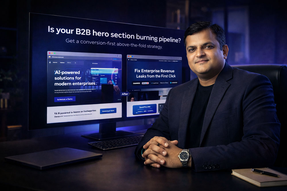
5. The visual is decorative, not explanatory
A stock image of smiling executives looking at a laptop doesn’t explain your workflow. Use actual product dashboards, friction heatmaps, or decision-flow graphics. Clarify, don’t decorate.
6. The “Sliding Carousel” of Clutter
Carousels kill conversions. Too many links, too much navigation, and competing asks create interpretation cost. Pick your strongest value proposition and stand by it.
The Executive Scorecard: Evaluate Your Hero in 5 Minutes
| Checkpoint | What to ask | What failure looks like | Business impact |
| Message Match | Does the hero continue the promise made in the ad? | Generic copy disconnected from campaign intent. | Lower conversion, weaker Quality Score. |
| Buyer Specificity | Is the ICP (Ideal Customer Profile) obvious? | “For everyone” messaging. | Unqualified traffic, wasted SDR time. |
| Outcome Clarity | Is the business result stated clearly? | Feature-heavy, jargon-loaded copy. | Slower comprehension, high bounce rate. |
| Trust Compression | Is proof visible immediately? | No logos, stats, or authority cues above fold. | Higher skepticism, lower CTA click-through. |
| CTA Direction | Is the next step obvious and stage-appropriate? | “Learn More” or competing primary CTAs. | Decision paralysis, abandoned sessions. |
What a Stronger “Read-and-Pause” Structure Looks Like
Here is the architectural structure I use for serious B2B landing page optimization:
- Headline: Lead with the business outcome. (“Fix revenue leaks in your paid traffic before they drain your quarter.”)
- Subhead: Clarify audience + mechanism + result. (“UXGen Advisory helps mid-market B2B teams diagnose first-screen friction and turn expensive traffic into qualified pipeline.”)
- Proof Strip: A line of recognizable client logos or a hard data point placed directly under the subhead.
- CTA Pair: Primary (Request an Audit) and Secondary (Download the Scorecard).
- Supporting Visual: An annotated UI teardown or a before/after message hierarchy.
📥 [PDF DOWNLOAD] The Above-the-Fold Pipeline Leak Scorecard
Don’t let passive design drain your Q3 marketing budget. I built this 15-point diagnostic PDF framework for CMOs and Growth teams to evaluate whether their first screen is helping pipeline or quietly sabotaging it.
Includes: Ad-to-page match checklist, mobile review prompts, and a rewritten B2B hero example.
👉 [Download the PDF Scorecard Here]
Why UXGen Advisory Is the Best Partner for Solving This
Most agencies are “make it cleaner” shops. They will redesign your hero to look modern, but they won’t diagnose the unit economics behind it.
At UXGen Advisory, we operate as an elite UX Audit & Conversion Intelligence partner. We work with mid-market and enterprise companies that already have traffic and positioning, but know the excruciating cost of wasted intent.
Our edge is simple, and deeply analytical:
- We audit message match, not just layout.
- We evaluate decision friction, not just visuals.
- We tie UX directly to qualified pipeline, trust, conversion rates, and CPA.
- We build surgical recommendations that your dev team can actually implement without a six-month site rebuild.
Case Study: Stopping the Bleeding for a B2B Services Firm
- The Context: A mid-market B2B professional services firm was spending heavily on LinkedIn Ads. Traffic was up, but commercial output was flatlining. Their CAC was unsustainable.
- The Approach: We didn’t redesign their brand. We conducted a friction audit. We found their above-the-fold section was a classic “Corporate Billboard”-polished but vague. We rewired the first screen around promise-to-page alignment, sharper ICP targeting, pulled trust signals above the fold, and fixed their premature “Book a Consultation” CTA by adding a lower-friction secondary path.
- The Outcome: Within 45 days, with media spend staying completely flat, qualified consultation requests increased by 135% and their CPA dropped by 48%. As the VP of Marketing told us: “We didn’t need more traffic. We needed the first screen to stop acting like a billboard and start acting like a filter.”
Frequently Asked Questions (FAQ)
What is above-the-fold optimization in B2B?
Above-the-fold optimization means rigorously improving the first visible screen of a webpage so visitors immediately understand the offer, trust the company, and know what to do next. In B2B, where buyers conduct independent digital research, a vague or slow hero section creates massive friction before the buyer even begins evaluating your software.
Why does the hero section matter so much for conversion?
Attention is incredibly top-heavy. Research from NN/g proves users spend the vast majority of their viewing time above the fold. The hero section must earn the scroll by reducing uncertainty and clarifying the value proposition. If it fails to do this, the page asks the busy enterprise visitor to work too hard, resulting in a bounce.
How does the hero section affect paid traffic performance?
It directly impacts your Google Quality Score and Cost Per Acquisition (CPA). Google evaluates landing page experience-including relevance, ease of navigation, and ad-match. A weak first screen breaks the conversational chain started by your ad, leading to wasted clicks and penalized ad accounts.
What exactly should a B2B hero section include?
A highly converting B2B hero includes five core elements: an outcome-driven headline, a clarifying subhead (who it’s for and how it works), visible social proof (logos/data), a strong primary CTA, and a lower-friction secondary CTA.
Should every B2B page have “Book a Demo” above the fold?
No. It depends on traffic intent. High-intent, bottom-funnel traffic is ready for a demo. Colder, research-stage traffic needs a lower-friction step, like downloading a scorecard or viewing a case study. Providing stage-appropriate CTAs prevents friction and decision paralysis.
How do I know if my above-the-fold section is underperforming?
Look at your analytics. Indicators of a failing hero section include bounce rates over 60% on paid traffic, weak click-through rates on your primary CTA, low scroll depth, and feedback from sales that inbound leads are “unqualified.”
Does page speed really matter for B2B landing pages?
Absolutely. Google explicitly ties landing page performance (Core Web Vitals) to conversion outcomes using real-world field data. A slow first-screen experience creates interpretation delays, spikes abandonment rates, and drastically lowers your commercial efficiency.
Conclusion: Stop Paying for Bounces
The above-the-fold area is not where you “set the brand mood.” It is where you either earn the next click or lose the buyer.
If your first screen is acting like a corporate billboard, you are paying a premium for buyer intent, and then forcing that intent to do extra interpretation work. That is a terrible trade-off for your marketing budget.
The fix is not more decoration or a trendy redesign. The fix is a tighter conversion system: clearer outcome language, sharper buyer targeting, proof before the scroll, and a clean CTA hierarchy.